Cedar Design System
Exploring how AI-assisted product development can streamline the design, documentation, and React implementation of a scalable design system—proven across three live products.
Role
Designer & Developer
Timeline
18 days
Team
Solo — AI-assisted (Claude Code, Lovable, Figma)
The Challenge
Most design system case studies end at Figma. The components look polished in the file, the token structure is sound, the variants are organized — and none of it has ever touched code. There’s no proof the system actually works when a real product is built on top of it.
I wanted to close that gap. Not with a theoretical exercise, but by designing a complete token-based design system, implementing it in React, documenting it with a custom-built site, and then building real applications on it — proving the system survived contact with production constraints.
The project had a secondary motivation: demonstrating fluency with AI-assisted development tools. I’d been using Claude Code, Lovable, and Figma’s AI features extensively, and I wanted a portfolio artifact that showed what that workflow actually produces — not as a novelty, but as a legitimate way to ship real work faster.
What I set out to build:
- A complete design token foundation with semantic color, responsive typography, spacing, radius, border, and layout systems
- A component library with full variant coverage, accessibility built in, and real token bindings — not just styled rectangles
- A custom documentation site that uses the system’s own components and tokens, proving the system by being built with it
- Multiple live applications demonstrating the system’s range across different product types
What Cedar Delivered
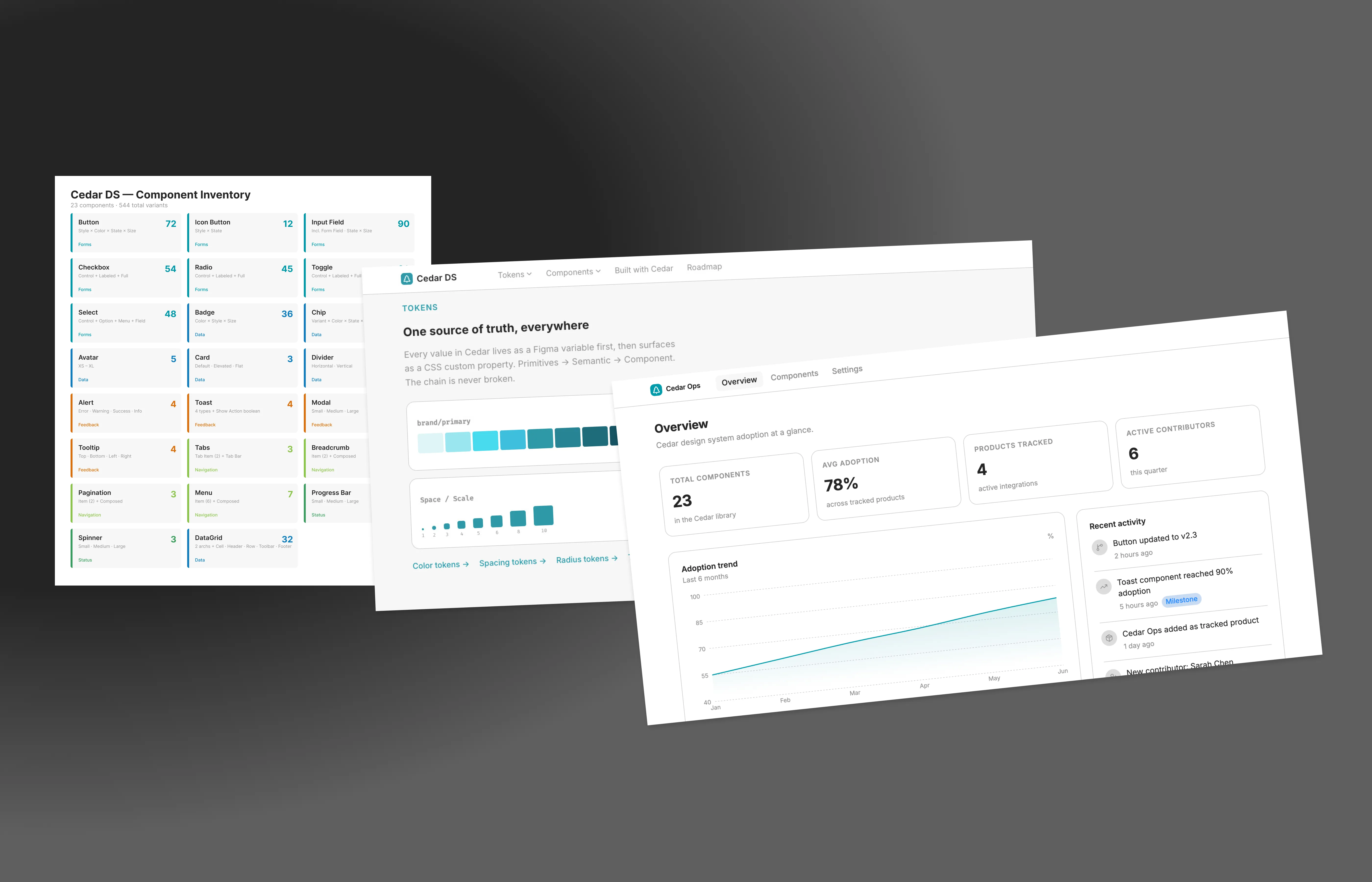
A complete design system designed, implemented, documented, and proven across live products in 18 days.
- 208 design tokens across color, typography, spacing, radius, border, and layout — with responsive modes for mobile, tablet, and desktop
- 23 production-ready React components with approximately 460 total variants, all built on the token foundation
- A custom documentation site built with Cedar’s own components and tokens — 21 component pages and 5 token reference pages, live at cedar-ds-documentation.vercel.app
- Two live products proving the system in production: DayLog (a health-tracking PWA) and Cedar Ops (a design ops dashboard using 22 of 23 components)
- 3 public GitHub repositories with the full source for the documentation site, Cedar Ops, and DayLog
- AI-assisted throughout — dual Claude Code sessions, Lovable for rapid prototyping, Figma for design
System Design
Token Architecture
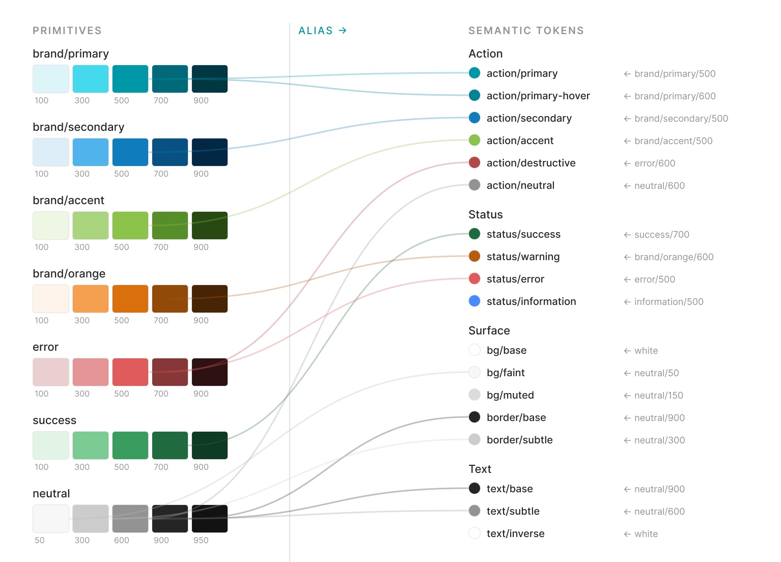
Cedar’s foundation is a two-layer token system: raw primitives that define the full value palette, and semantic tokens that assign meaning.
Color follows this split precisely. The primitive layer provides brand color ramps (primary, secondary, accent) and status palettes (error, warning, success, information), each spanning a full range from lightest to darkest, plus a matching neutral scale. The semantic layer maps these to purpose: bg/base, text/subtle, action/primary-hover, status/error-bg. This separation means the entire visual identity can shift by repointing the semantic layer without touching any component.
Typography uses variable collections for size, line-height, and semantic role (body, heading, and title, each at small, medium, and large), across two font families — Inter for body, Fira Code for mono. Size and layout collections include responsive modes for Mobile and Desktop, so typography scales automatically without component-level breakpoint logic.
Spacing is a two-tier system: a raw numeric scale based on a 4px unit, plus a small set of named semantic tokens mapping to the most commonly used values. Components reference the semantic tokens; the raw scale exists for edge cases.
Radius, border, and grid/layout round out the foundation, each with responsive Desktop, Tablet, and Mobile modes where relevant.
The entire foundation: 208 variables across 6 collections, all published and verified in Figma.
Component Library
23 component sets, approximately 460 total variants, organized into six categories:
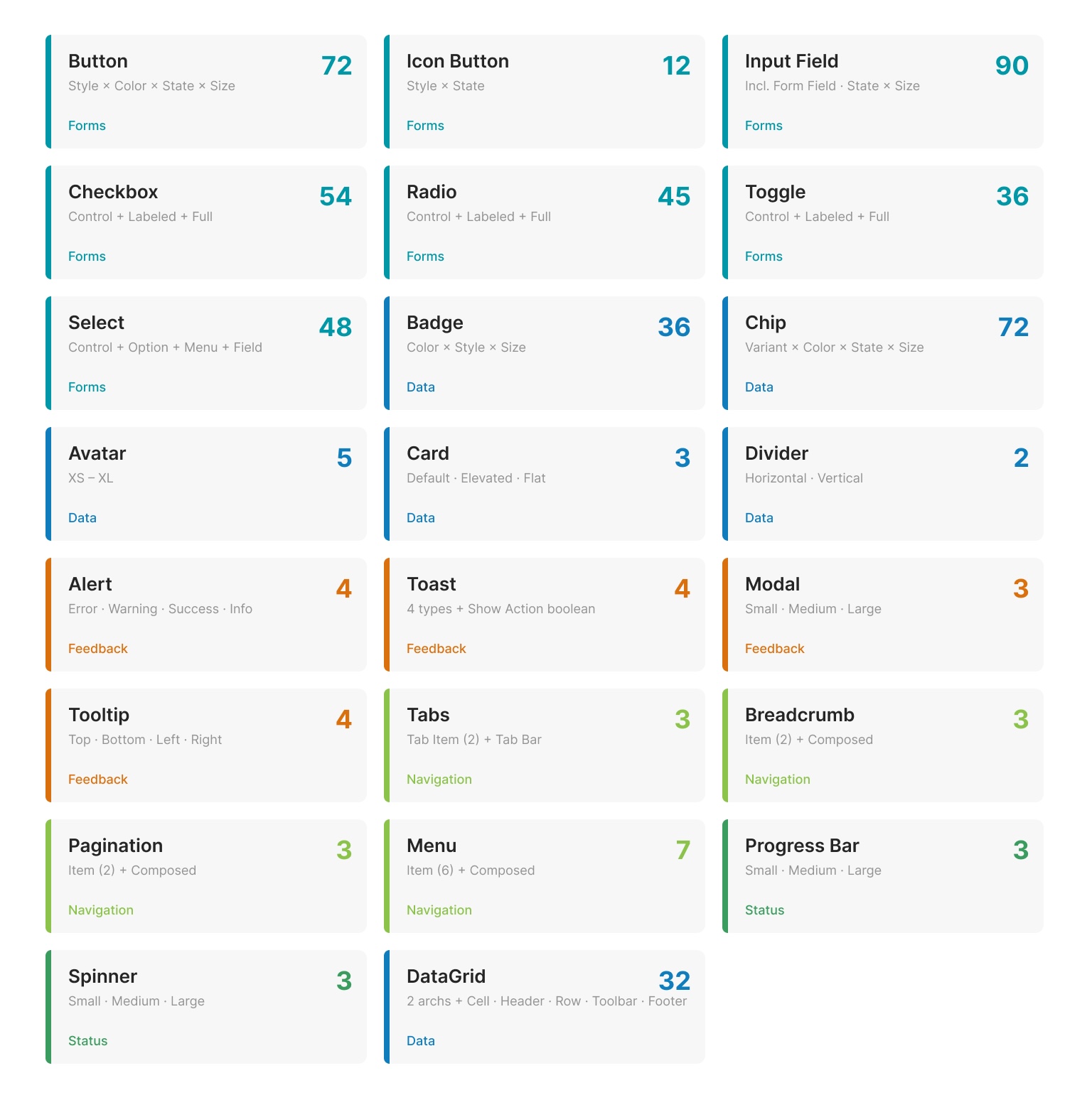
Inputs: Button (spanning style, color, size, and state), Icon Button, Input Field, Form Field, Checkbox, Radio, Toggle, and the full Select system (Control, Option, Menu, and Field as composable pieces).
Data Display: Badge, Chip, Avatar, Divider, Card, and Data Grid — including two Data Grid architectures (row-oriented and column-oriented) to support different data density needs.
Feedback: Alert, Toast, Modal, and Tooltip — each built with semantic color token bindings so status variants (error, warning, success, info) are driven by the token layer, not per-component color overrides.
Navigation: Tabs, Breadcrumb, and Pagination — all built as composable item + container pairs.
Overlays: Menu, with variants covering the common item states.
Status: Progress Bar and Spinner, each at multiple sizes.
Every component uses real token bindings, not hardcoded values. Every component includes instance-swap slots where applicable. Every component was built with accessibility requirements defined upfront — ARIA patterns, focus management, and contrast ratios are specified in the component structure, not added after visual design.
Design Decisions Worth Noting
Composable over monolithic. Components like Checkbox, Radio, and Toggle ship as three layers: a raw Control, a Control + Label pair, and a Full field wrapper with description text. This lets products use the right level of abstraction — a compact settings panel uses Controls directly; a form uses the Full wrapper with validation.
Color palette revision mid-project. Partway through implementation, I revised the full brand palette — primary shifted to teal, secondary to blue, accent to green, and the success ramp was rebuilt for better contrast. Every semantic token was repointed and WCAG-verified. Because the token architecture separated primitives from semantics, this affected zero component logic — exactly the resilience the system was designed for.
No dark mode in v1 — by design. Figma’s variable modes support it, and the semantic token layer is structured to enable it, but shipping a complete, verified light mode was more valuable than shipping two half-finished modes. Dark mode is documented on the roadmap as a v2 priority.
Implementation
AI-Assisted Workflow
This project was built with AI tools as primary collaborators, not occasional assistants. The workflow:
Figma for all design work — token definition, component construction, variant management, and the visual source of truth for every implementation decision.
Claude Code for React implementation, the documentation site, and production refinement. Claude Code read the Figma files directly through MCP integration, auditing the token structure and component inventory before any code was written. Throughout the project, Claude Code maintained a standing instruction: enforce the v1 scope boundary and redirect any scope creep to v2.
Lovable for rapid prototyping of Cedar Ops. The dashboard’s layout, page structure, and mock data were built in Lovable in a single session, then handed off to Claude Code for the Cedar component integration. This split — Lovable for structure, Claude Code for system fidelity — turned out to be an effective division of labor.
The result: two parallel Claude Code sessions running simultaneously — one working in Figma for design refinements, the other building React components and documentation pages — with handoff specs passing between them. This isn’t a theoretical AI workflow; it’s how the project actually shipped.
Documentation Site
The documentation site is the bridge between the design system and its proof. Built with Astro and React islands, deployed on Vercel.
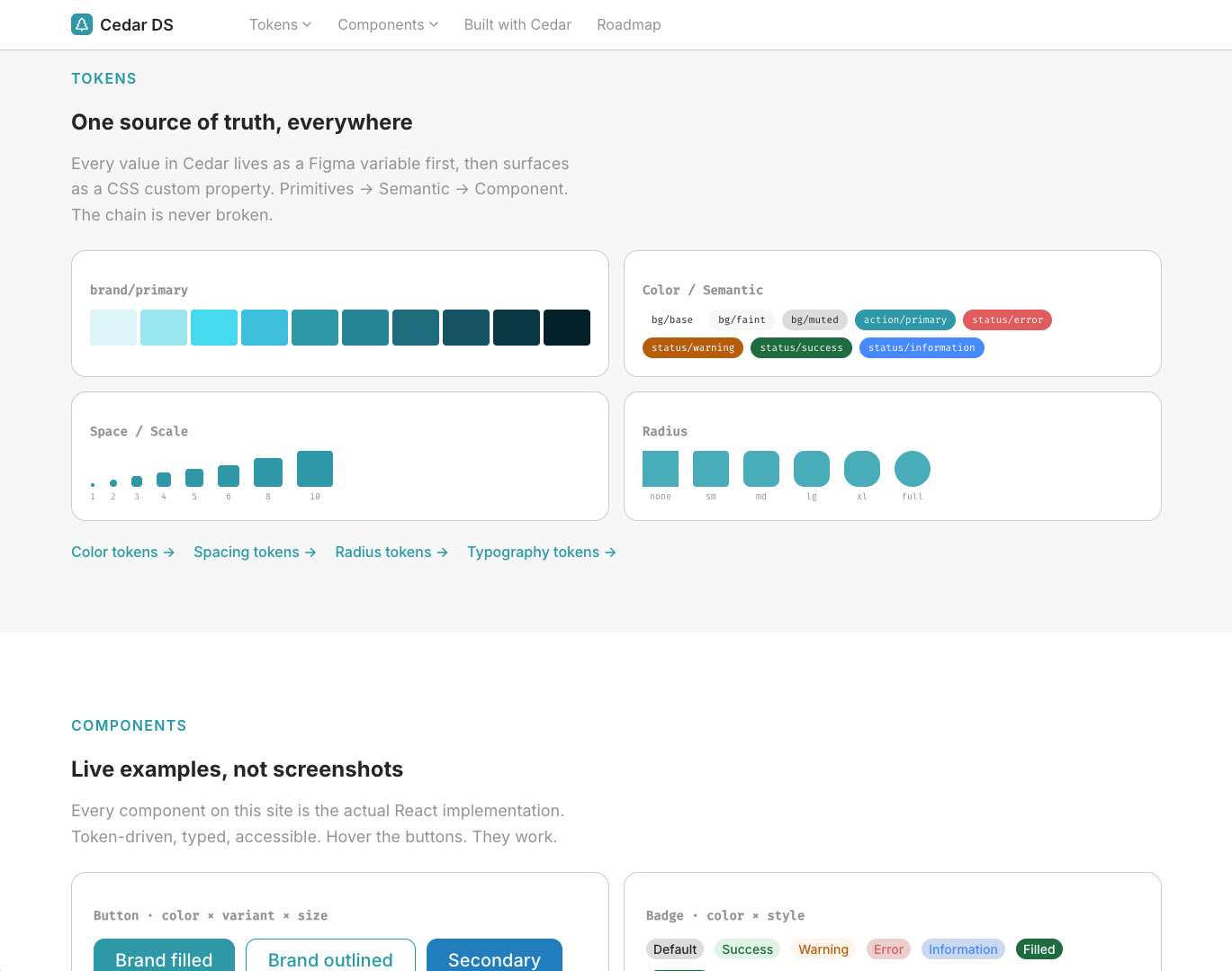
The key decision: the site itself is a Cedar artifact. Every color, spacing value, radius, and typographic choice on the doc site comes from Cedar’s own CSS custom properties, with 1:1 naming from the Figma variables. The site doesn’t just document the system — it demonstrates the system by being built with it.
Scope: 5 token reference pages (color, spacing, radius, typography, border), 20 component pages with live rendered examples using the actual Cedar React implementations, a “Built with Cedar” section linking to live applications, and a roadmap documenting what’s shipped versus what’s planned.
The component pages aren’t screenshots or static mockups. Each one renders the real Cedar React component with its actual variants and states. The Button page shows the full style × color × size × state matrix. The Select page demonstrates all four composable sub-components. The Modal page opens a real modal.
Live: cedar-ds-documentation.vercel.app
DayLog — A Health Tracking PWA
DayLog is a quick-tap health logger designed for iPhone, built as a Progressive Web App. It was the first product built on Cedar, and it exercises the system’s input components in a mobile-first context: Button, Input Field, Form Field, Checkbox, Chip, and Spinner.
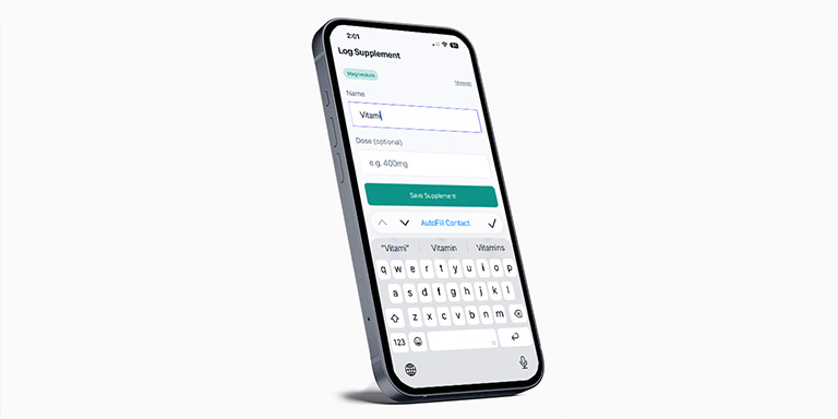
The app has its own design identity (indigo brand color, health-focused UI) while sharing Cedar’s spacing, radius, and typographic scale — proving the tokens are flexible enough to support product-level customization without breaking system consistency.
Features: workout and supplement logging with custom dropdowns, a preset system that auto-saves frequently logged items, day-by-day history navigation with swipe, full PWA support (offline, add-to-homescreen, iOS safe area handling), light and dark mode, and accessibility throughout.
Live: daylog-mu.vercel.app
Cedar Ops — A Design System Adoption Dashboard
Cedar Ops is where the system’s full range becomes visible. It’s a multi-page design ops dashboard tracking component adoption across products — and it’s built entirely with Cedar’s own React components and tokens. A design system tracker that proves the system it tracks.
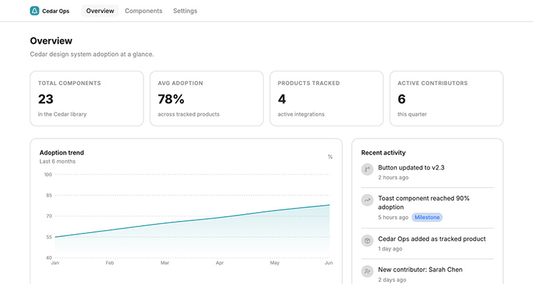
Why it exists: DayLog uses 6 of Cedar’s 23 components. Cedar Ops exercises 22 of 23 — covering Data Display, Feedback, Navigation, Overlays, and Status categories that a health logger never needs. Together, the two apps prove virtually the entire system.
Four pages, each exercising different component categories:
Overview — Card, Badge, Progress Bar, Chip, Avatar, Divider, Spinner, and Tabs displaying adoption metrics, trend charts, and an activity feed.
Components table — a token-styled data table (Data Grid’s React implementation is a v3 item, so the table uses Cedar tokens directly) with Badge for status, Chip for categories, Pagination, Select for filtering, Input Field for search, and Checkbox for selection.
Component detail — Tabs for section navigation, Breadcrumb for wayfinding, Modal for confirmations, Tooltip for contextual data, Alert for breaking-change notices, Toggle, and Button.
Settings — Form Field, Input Field, Radio, Toggle, Select, Toast (with a custom Cedar ToastProvider/useToast context system replacing the prototype’s third-party toast library), Button, Menu, Modal, and Checkbox.
Build process: Prototyped in Lovable for rapid layout and mock data, then every Lovable/shadcn component was replaced with Cedar’s actual React implementations in Claude Code. The final codebase imports exclusively from the Cedar component directory — zero third-party UI dependencies remain.
Live: cedar-ops-rust.vercel.app
Results
Business impact:
- A shared token architecture that lets any product adopt new branding without rewriting components — proven mid-project when the entire brand palette shifted with zero component logic changes
- A reusable component library that eliminates duplicated UI work across products while improving consistency and accessibility by default
- A documentation platform that removes ambiguity between design and engineering by giving both sides the same production-ready source of truth, not a static spec that drifts from what ships
System scope:
- 208 design tokens across 6 Figma variable collections
- 23 component sets with approximately 460 total variants
- Full responsive support (typography and grid adapt across Mobile, Tablet, and Desktop)
- WCAG-verified color contrast across all semantic token pairings
Shipped artifacts:
- Cedar design system in Figma (Foundations + Components)
- Custom documentation site — 25 pages, built with Cedar’s own tokens and components
- DayLog — a functional PWA using 6 Cedar components
- Cedar Ops — a multi-page dashboard using 22 of 23 Cedar components
- 3 public GitHub repositories
Component coverage across products:
- DayLog alone: 6 of 23 components (26%)
- Cedar Ops alone: 22 of 23 components (96%)
- Combined: 22 of 23 components (96%) — only Data Grid absent, deferred to v3
AI-assisted development:
- Dual Claude Code sessions running simultaneously (Figma + React)
- Lovable for rapid dashboard prototyping, Claude Code for system integration
- Figma MCP integration for direct file reading during implementation
- Scope enforcement via standing instructions in Claude Code sessions
Reflection
What surprised me:
The biggest surprise wasn’t the speed — it was discovering that AI-assisted development made design decisions more deliberate, not less. When implementation becomes dramatically faster, the bottleneck shifts. Instead of spending days translating Figma specs into code, most of my time went to system architecture: how tokens should relate to each other, which component boundaries would hold under real usage, and where the abstraction layers should sit. The tools handled the translation. I focused on the thinking.
The other surprise was how naturally scope enforcement worked when externalized to AI. Telling Claude Code “if I suggest adding something not on the v1 list, redirect me” meant the discipline wasn’t mine to maintain through willpower. It was built into the workflow. That pattern — using AI not just to build faster but to stay focused — was something I hadn’t planned for and would use again immediately.
What worked well:
Building the documentation site as a Cedar artifact was the single most effective decision of the project. It collapsed the gap between “here’s what the system looks like” and “here’s proof it works” into one URL. Every reviewer who visits the doc site is seeing Cedar’s actual components rendering in production, not screenshots of a Figma file.
The token architecture proved its value during a mid-project color palette revision. Repointing the brand primary, secondary, and accent colors across the entire system required changing semantic token assignments and nothing else. Zero component logic was affected. That’s the promise of separating primitives from semantics — this project generated the evidence.
The Lovable-to-Claude Code handoff for Cedar Ops worked better than expected. Using each tool for what it does best — Lovable for speed and layout, Claude Code for system fidelity and component integration — was more effective than trying to make either tool do everything. The prototype went from blank canvas to working layout in a single session, then Claude Code replaced every default component with the real Cedar implementation.
What I’d do differently:
Plan for the Data Grid’s implementation complexity earlier. It’s the one component that exists in Figma but hasn’t shipped in React, and its absence required a workaround in Cedar Ops. Starting the React implementation sooner — even a simplified v1 — would have closed the only remaining gap in component coverage.
Establish custom domains from the start. Deployment URLs are functional but not portfolio-ready. A small detail that’s easy to overlook during a build sprint and worth setting up before sharing work publicly.
Invest in business outcome framing earlier in the process. My first draft of this case study led with component counts — 208 tokens, 23 components — rather than the problems they solve. Cedar proves technical capability: the token architecture works, the components render, the system holds under real usage. But proving capability and communicating impact are different exercises, and I’d initially only done the first one. Once I recognized the gap, I rewrote the Results section around what the system actually enables: shared tokens that let products adopt new branding without touching component logic, a component library that eliminates duplicated UI work across products, and documentation that removes ambiguity between design and engineering. The lesson wasn’t really about Cedar — it was a reminder of how easily the person who built something defaults to describing it by what they did, rather than what it changed.