Enterprise Data & Analytics Dashboard
Modernizing a legacy enterprise dashboard into a scalable, user-centered platform
Role
Senior UX/UI Designer
Timeline
6 months
Team
2 designers, 6 engineers, 2 PMs
The Challenge
Lithia & Driveway (NYSE: LAD), one of the largest automotive retailers in the U.S., relied on a decade-old ASP.NET-based dashboard to deliver analytics across the organization. Originally built for a narrower scope, this legacy system had become outdated and increasingly misaligned with user needs.
The user base spanned multiple organizational levels: C-suite executives, Regional VPs/Directors, General Managers, Sales Managers, and Accounting Staff. Each group had distinct data needs, goals, and workflows. Creating a unified, flexible solution meant balancing high-level strategic insights with granular, day-to-day operational data.
Core problems:
- Features were added reactively over time, resulting in fragmented experiences and visual inconsistency
- No mobile access, creating significant issues for field-based users needing real-time data
- Complex navigation and unclear information architecture made finding reports difficult
- Store selection and filter configuration processes were cumbersome
- Users couldn’t save custom views or filter presets for recurring analysis
- Training new users was time-consuming due to UX inconsistencies
This wasn’t just a technology upgrade. It was a strategic redesign grounded in UX research and system scalability.
Research & Discovery
Contextual Inquiry
Conducted formal contextual interviews with end users across five distinct user groups: Executives, Regional VPs/Directors, General Managers, Sales Managers, and Accounting Staff. Using a structured facilitation guide and moderator script, I observed users in their actual work environments to understand:
- Daily and weekly decision-making workflows
- Current tools and data sources they relied on
- Specific tasks that required dashboard data
- Pain points and workarounds in existing processes
Interview structure:
- Current state observation: Watched users navigate existing tools and complete real tasks
- Task walkthroughs: Asked users to demonstrate how they currently access critical data
- Pain point exploration: Probed frustrations, inefficiencies, and unmet needs
- Future state visioning: Discussed ideal workflows and desired improvements
This contextual approach revealed not just what users said they needed, but what they actually did. It often uncovered gaps between stated preferences and observed behavior.
“I spend more time trying to find the right report than I do actually analyzing the data.”
— Regional Manager
User Journey Mapping
Created comprehensive journey maps documenting current and future state workflows for three primary user archetypes:
Executive+: Needed portfolio-level visibility across multiple stores with the ability to drill down into individual store performance. Required high-level dashboards with strategic KPIs and the flexibility to pivot between store profiles.
Regional Manager: Managed multiple stores within a region, requiring both aggregated views and individual store analysis. Needed efficient store selection and the ability to save custom store groupings for recurring analysis.
Store Manager: Focused on single-store performance with deep operational metrics. Required quick access to their specific store data without navigating complex selection processes.
Journey mapping revealed critical workflow phases where users experienced friction:
- Access & Authentication: SSO integration needed to be seamless
- Orientation: Users struggled to understand navigation and find relevant dashboards
- Store Selection: Complex multi-step process for configuring store views
- Report Discovery: Unclear information architecture made finding specific reports difficult
- Data Manipulation: Limited filtering options and no ability to save custom configurations
- Download & Export: Inflexible export options that didn’t match user needs
Workflow Mapping
Documented the existing data request pipeline through observation and interviews:
- User navigates to dashboard from enterprise portal
- Authenticates via SSO
- Attempts to find relevant report through trial-and-error navigation
- Configures store selection (often losing configuration between sessions)
- Applies filters to narrow data
- Reviews report, often finding defaults don’t match expectations
- Manually configures view preferences each time
- Downloads data in limited formats
This workflow revealed critical bottlenecks: users spent excessive time on configuration and navigation rather than actual data analysis. The lack of saved presets meant repeating the same setup steps for recurring reports.
Competitive & Pattern Analysis
Analyzed leading analytics tools (Looker, Tableau, Metabase, and Amplitude) to identify effective patterns for:
- Dashboard composition and layout
- Filter and drill-down interactions
- Data visualization best practices
- Saved views and preset management
- Permission and sharing models
Key Insights
Analysis of contextual interviews, journey mapping, and workflow observations surfaced several critical themes:
- Role-based dashboards are essential: Different user types needed fundamentally different default views and data access patterns
- Context over data: Users didn’t need more charts; they needed metrics paired with context about what changed and why
- Configuration persistence: Inability to save store selections and filter presets created repetitive work
- Progressive complexity: Executive summaries up front, with the ability to drill into detail on demand
- Navigation clarity: Information architecture needed to align with how users thought about their work, not how the system was organized
- Trust through transparency: Showing data freshness, sources, and definitions increased user confidence in the platform
User Personas
Synthesized research findings into detailed user personas that guided design decisions throughout the project. Each persona documented goals, frustrations, needs, motivations, primary activities, and current tools.
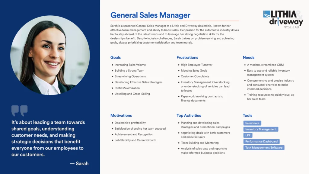 Example persona: Sarah, General Sales Manager
These personas became shared references across the product team, ensuring alignment on user needs during design and development decisions.
Design Process
Information Architecture
Restructured the platform around role-based navigation and flexible views:
- Role-based home dashboards: Customized landing pages for Executives, Regional Managers, and Store Managers with relevant KPIs surfaced immediately
- Streamlined store selection: Simplified process with saved store profiles and quick-switch functionality
- Improved report organization: Restructured navigation to align with user mental models and common tasks
- Persistent configurations: Saved filter presets and view preferences that persisted across sessions
- Mobile-optimized layouts: Responsive designs prioritizing critical metrics for field access
Design System Foundation
One of my most impactful contributions was designing and partially developing a branded design system for Lithia & Driveway’s enterprise applications.
While other tools in the ecosystem used out-of-the-box Material UI, I created:
- Custom Figma component library aligned with brand guidelines
- Material UI theming tailored to enterprise needs
- Consistent UX patterns that could scale across multiple applications
- Data visualization standards for charts, tables, and metric cards
Design system outcomes:
- Established consistency across the product ecosystem
- Reduced front-end rework and improved engineering handoff
- Created a scalable foundation for future enterprise products
- Elevated design maturity across the organization
Key Features & Components
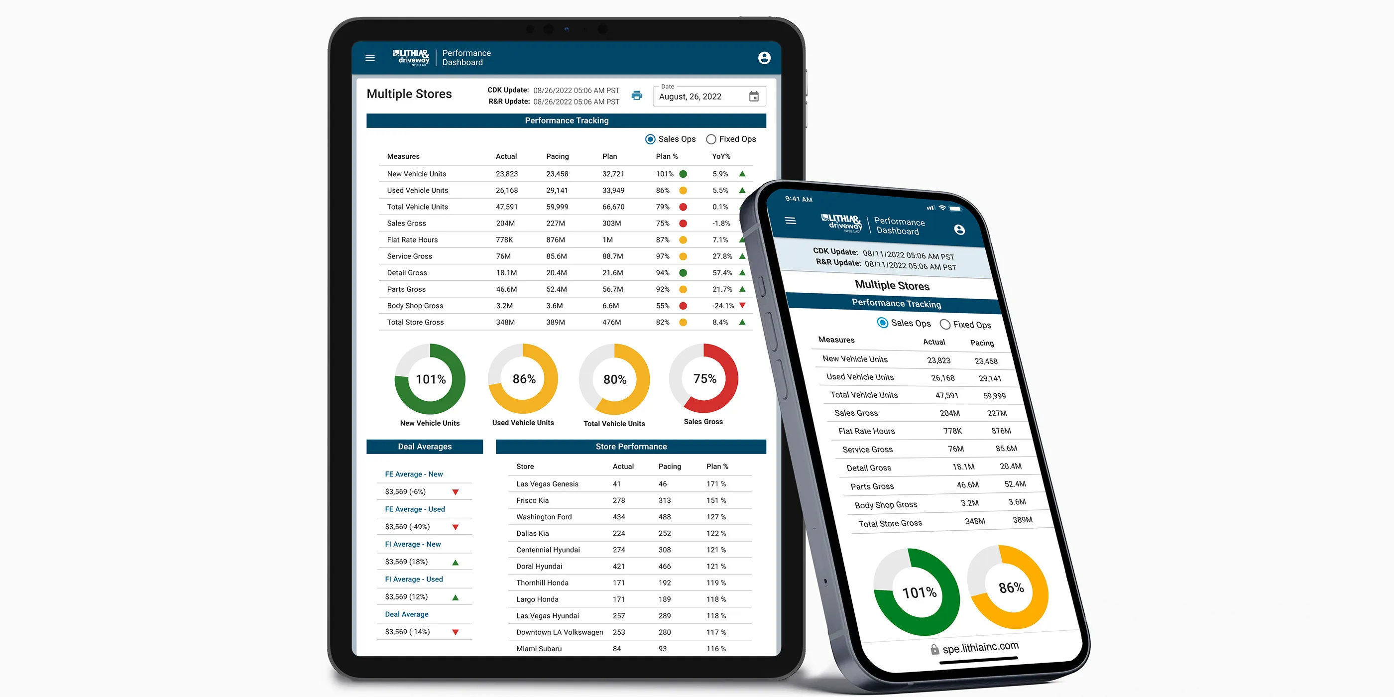
Role-based dashboards: Created three distinct dashboard experiences tailored to Executive, Regional Manager, and Store Manager workflows. Each dashboard surfaced the most relevant KPIs and reports for that role’s decision-making needs.
Store selector redesign: Simplified the complex multi-step store selection process into an intuitive interface with:
- Saved store profiles for recurring analysis
- Quick-switch between frequently accessed stores
- Visual confirmation of current selection context
- Bulk selection tools for regional managers
Saved filter presets: Enabled users to save custom filter configurations and view preferences, eliminating repetitive setup work for recurring reports.
Metric cards: Each KPI displayed:
- Current value with clear visual hierarchy
- Trend indicators and comparison periods
- Context-aware drill-down to supporting data
- Responsive behavior from mobile to desktop
Enhanced navigation: Restructured the information architecture to align with user workflows rather than system organization, making report discovery intuitive and efficient.
Download & export improvements: Flexible export options allowing users to select data ranges, formats, and included fields based on their specific needs.
Prototyping & Validation
Collaborated closely with stakeholders and engineers to prototype and validate key dashboard patterns. Iterative testing focused on:
- Role-based dashboard effectiveness for different user types
- Store selection workflow and saved profile functionality
- Navigation models and report discoverability
- Filter preset creation and management
- Mobile interaction patterns for field users
- Data visualization clarity and accuracy
The new platform was built using a Next.js + React stack, ensuring modern performance, modularity, and long-term maintainability.
Results
The redesigned dashboard successfully addressed the shortcomings of the legacy tool:
- Improved usability and consistency through a shared design system
- Role-based customization delivered tailored experiences for Executives, Regional Managers, and Store Managers
- Mobile access enabled for real-time decision-making in the field
- Reduced configuration time through saved store profiles and filter presets
- Improved navigation made report discovery faster and more intuitive
- Reduced training time due to consistent, intuitive patterns
- Scalable foundation established for future internal tools across LAD’s digital ecosystem
- Design maturity increased organization-wide, positioning UX as a strategic partner
Reflection
This project reinforced the importance of rigorous user research and systems thinking in complex enterprise environments. The biggest wins came from deeply understanding user workflows before proposing solutions: observing how people actually worked, not just how they said they worked.
What worked well: Conducting formal contextual inquiry with structured protocols paid dividends throughout the project. Watching users navigate their existing workflows in real time surfaced pain points and workarounds that wouldn’t have emerged in traditional interviews.
The journey mapping process was particularly valuable. It revealed that different user types needed fundamentally different experiences, not just different data. This insight led directly to the role-based dashboard approach, which became one of the most impactful features of the redesign.
The persona artifacts became invaluable alignment tools. Every design decision could be traced back to specific user needs we’d documented. Building a comprehensive design system (rather than just designing screens) was equally impactful. It not only solved immediate interface challenges but established a foundation for long-term UX and engineering efficiency across multiple products.
What I’d do differently: Bring data engineering into the design process earlier. Some of our most elegant UI solutions hit constraints in the data pipeline that could have been identified sooner with closer collaboration. I’d also invest more time in quantitative baseline metrics before launch. While we gathered strong qualitative evidence of improvement, having hard numbers on task completion time and error rates from the legacy system would have made the impact story even more compelling.
Additionally, while we addressed the major pain points around store selection and navigation, there were opportunities to push further on data manipulation capabilities that could have made the platform even more powerful for advanced users.